
The colors in furniture – GREEN
The colors in furniture – GREEN
The colour plays an essential role in the furnishings of a house. It represents its own essence and it shall transmit some feelings.
They are the claim to furnish a complete guide of all the possible shades. At least I want to indicate which are the most appropriate colours to the different rooms and stile of a house.
Green is the colour of nature, so averything that is ecological, that is bio, that doesn’t pollute, that is “green”. For these reasons it inspires clean and relaxing feelings.
Green is typically the perfect colour when all goes well. The traffic light is green? Ok you can pass. The warning light is green? Ok there aren’t problems.
Green isn’t a primary colour, but it is made up of a mixture of yellow and blue. With predominance of the first one for the light and warm green, with a major percentage of the second one for the colder and darker shades. Mixed with white we arrive almost to the crayon shades of celery and apple green.
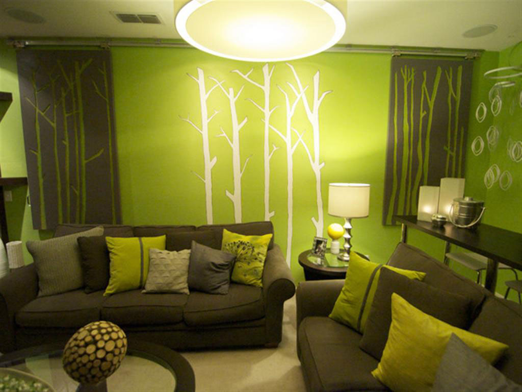
For all these reasons that obligatory bring back to the reminescence of nature, in furnishig too, is better not to use a unique shade of green, but many combinations. It’s better to recreate different shades of green that there are in a garden.
For the same reasons above written, it is a colour that matches with natural wood or with moka colour. An other combination that I really like is with pink, overall in floral designs.
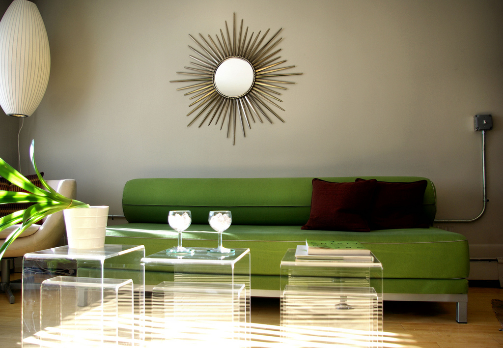
A dark green, or an olive green, transmits a deep sense of trust and safety. In fact, in many countries it is used as police colour. To us, their colour is blue, for the same values.
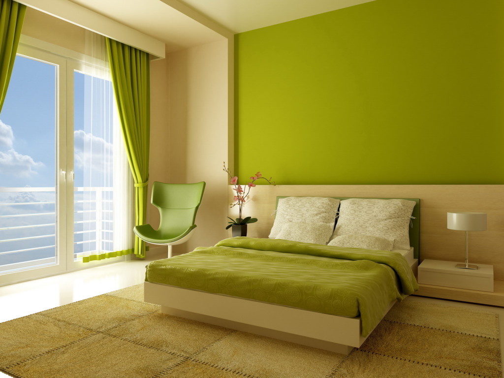
A light green, instead, transmits all the characteristics of innovation, youth and vitality, The seed that borns, the bud that grows up, etc.
Green in bathrooms takes to zen atmosphere. But it has to be a natural green and combined to the candor of white. In an establishment, I would combine bamboo trunks that inmediatly take the guest to an oriental spa room. The feeling of wellness is automatic and immediate. For places where there are mirrors, I would avoid sour shades because they give to the skin tone an off colour.
Celery green is an elegant choice for fixtures and doors, front doors and inner doors too. Especially if it is combined to a more intense green or to wooden furniture. Together with lilac or lavender colour, instead, green will assume immediately a sweeter and more femenine aspect.
In the mint shade you can pleasantly combine to chocolate brown, to really light lavender, to other crayons colours and why not, to gold.
Green matches well to red too, because they are complementary colours. We need only to think to this match in nature, for example in the holly or other plants. In furnishing you shall pay attention not to exceed: is always better that a colour prevails over the other one and that it shall match with a neutral predominant third colour.
In general where the light is more intense you should adopt blue-green colours or cold green ones but where the light is dark you should use warm shades and groundy green colours.
For a closer look at the color RED click the following link RED
For a closer look at the color YELLOW click the following link YELLOW
For a closer look at the color BLUE click the following link BLUE
For a closer look at the color BROWN click the following link BROWN
For a closer look at the color ORANGE click the following link ORANGE
For a closer look at the color VIOLET click the following link VIOLET
For a closer look at the color PINK click the following link PINK
For a closer look at the color GREY click the following link GREY
For a closer look at the color WHITE click the following link WHITE
For a closer look at the color BLACK click the following link BLACK
If you are interested in my decorating or interior design articles, follow my blog in the “Furniture & Interior Design” section where you will find all the information, links Blog di Alice – Furnishing & Interior Design
If I can be useful with any information, do not hesitate to contact me at info@ortalloggi.com
Alice – www.ortalloggi.com
Sources:
- caseeinterni.blogspot.it “uso del colore verde”;
- grafigata.com “come scegliere il colore del logo”;
- deabyday.tv “come arredare con il verde”;
Photos in the gallery are taken by me during some photo sessions in my homes, or taken from google images, with open source license.